The Process
I took on the EnglishConnect3 project while it was half way through development. Analytics and student testing was telling us students were not using the application as much as BYU Pathway needed. In fact, students were going to other third-party applications to learn English because the current version of the app wasn't cutting it. It was my job to fix the usability and keep students engaged.
I started by doing all the research that should have been done before I arrived. I came up with some ideas around "gamification" that we were able to test on students. We also cut out a lot of the "fluff" that was just confusing users. A lot of what we had to do was redesign the way the curriculum was presented. The curriculum was very powerful but it was only effective when taught in a classroom setting. I convinced the curriculum writers that we needed a drastic shift of thinking to be able to deliver the curriculum online in an efficient manner.

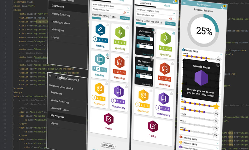
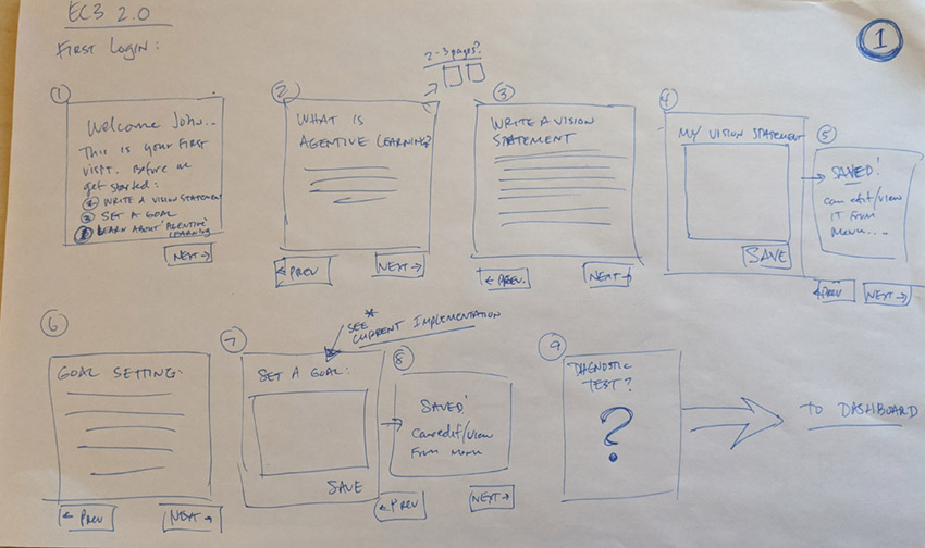
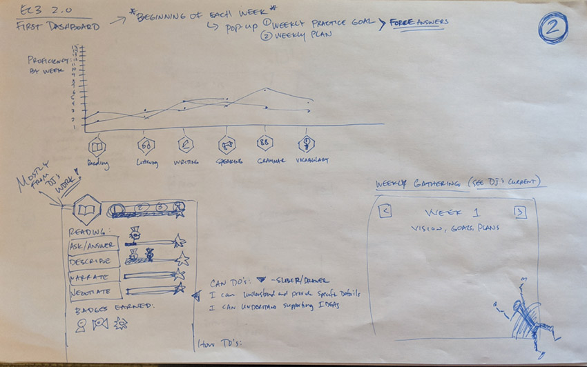
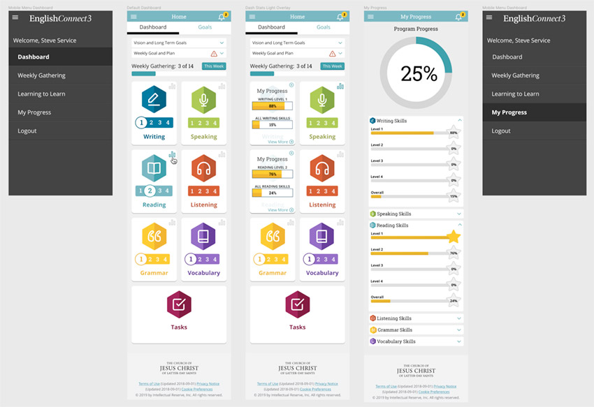
Since I came on midway through development, most of the design and UI was already in place. Anything new I created needed to use the same styles, but I was able to update some user journeys and simplify the UI for use on mobile devices where 90%+ of the students use the application.
Final Outcome
After implementation and over the course of six months, there was a huge spike in app use. Users were much happier and because more users were engaged, we were able to test more extensively and plans have been made to improve the next version even more.
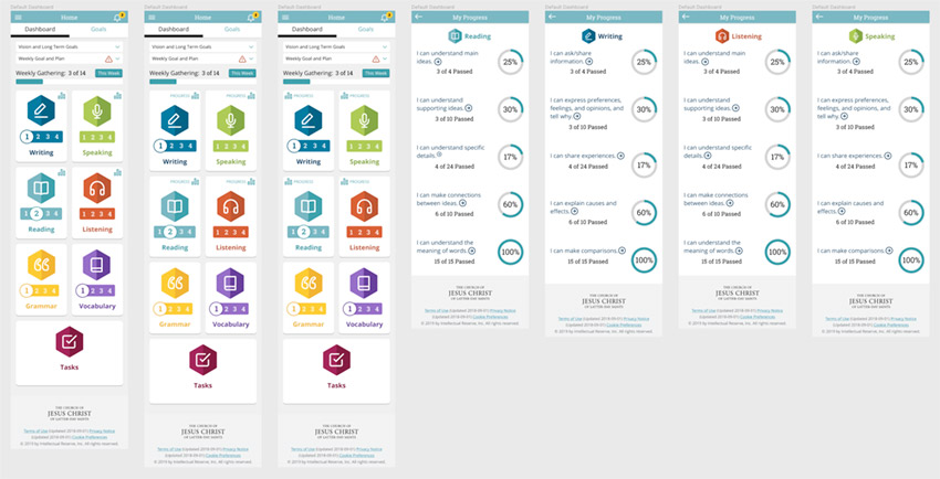
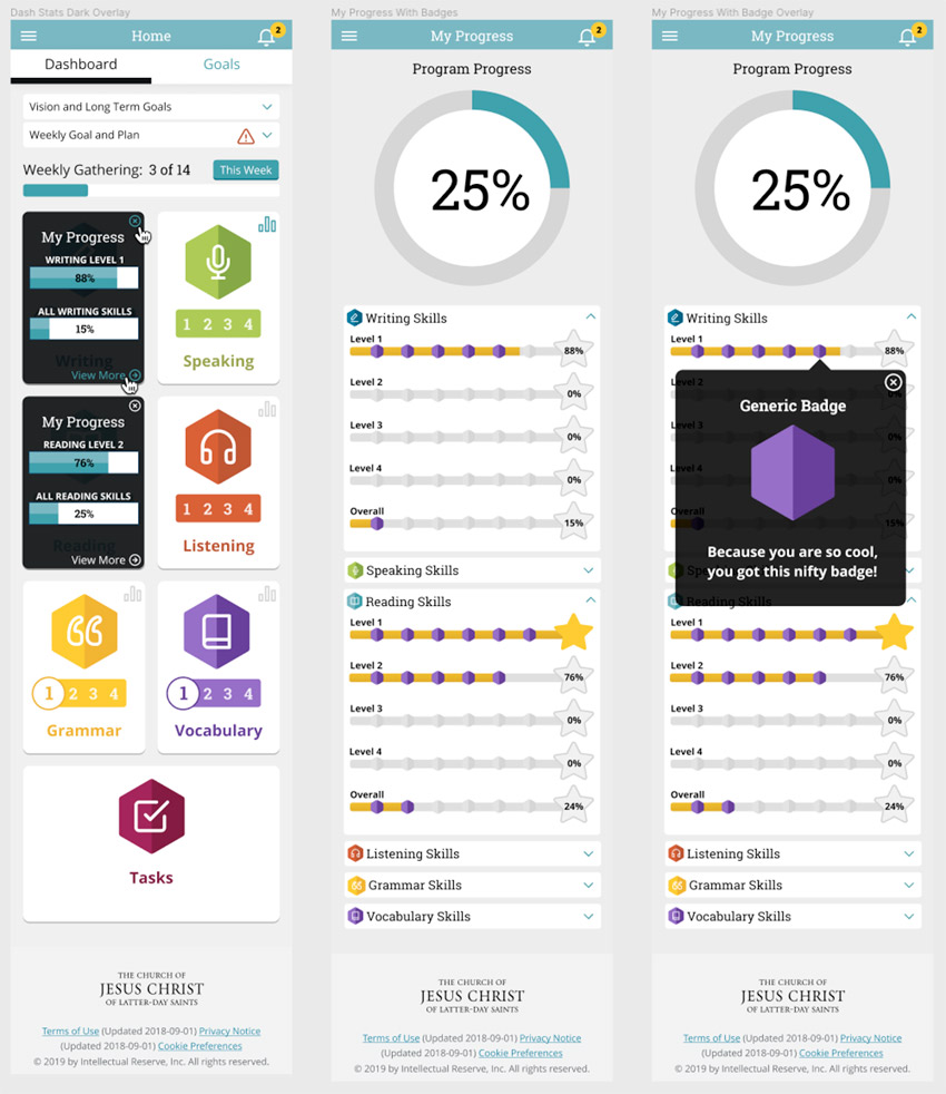
The BYU PathwayConnect education program only accepts applicants with a certain level of English proficiency. This app teaches English and gets students proficient.
UX Research, UX Design
Project is currently in production and being used by students all over the world.