The Process
This project deep down was a basic redesign with a new style guide. The hard part was improving the existing UX along the way. Because the new style guide was so new, there were many components that had to be designed, submitted, and approved by the Visual Identity Office. I was part of running several design committees that came up with several new components that would work for web applications and not just web sites.

UX Design in Sketch
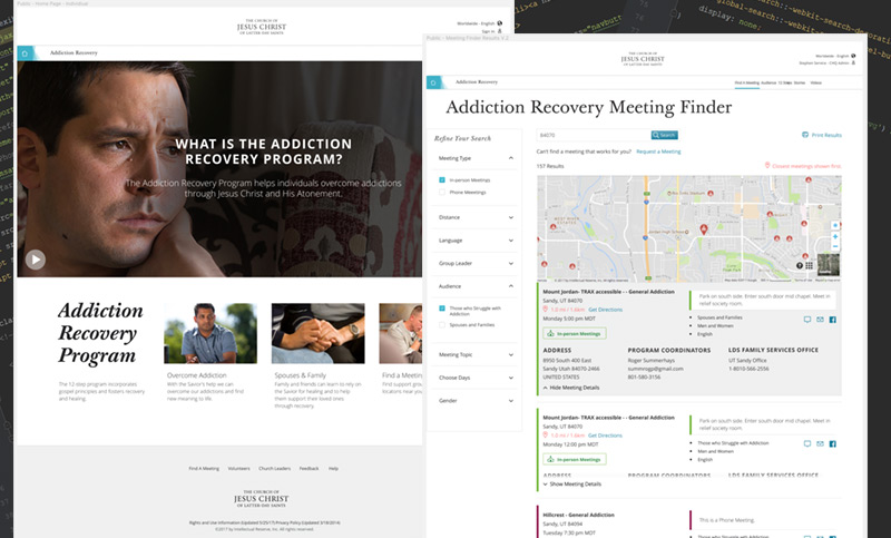
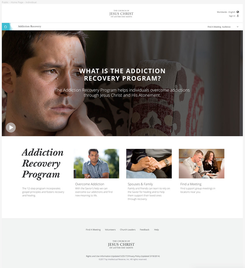
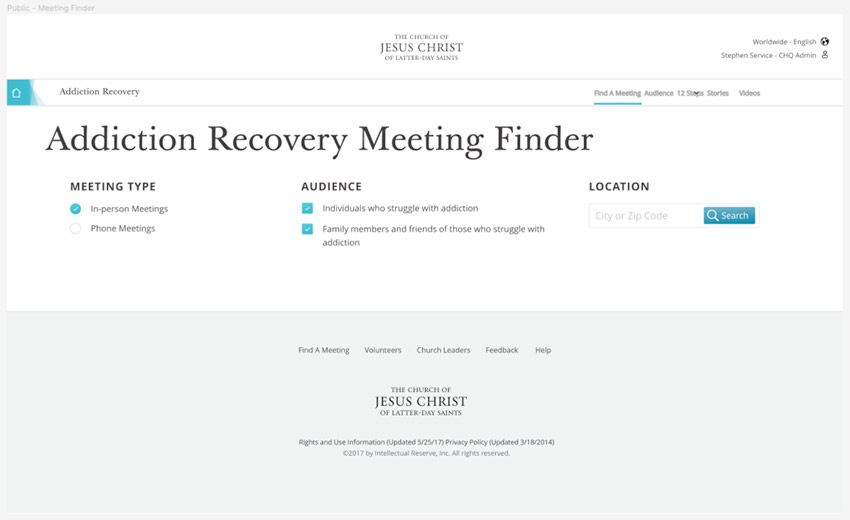
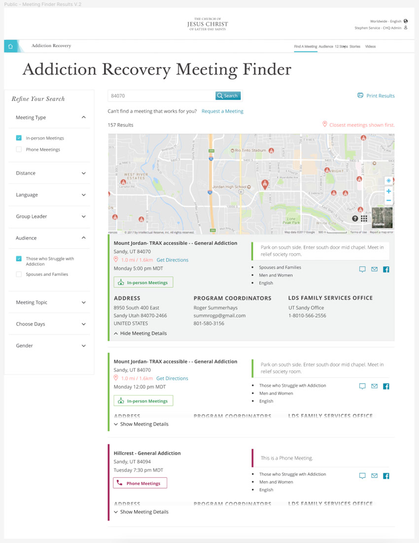
Before migrating my design work to Figma, I was using Sketch for designs and InVision for prototyping. The Addiction Recovery application was one of the last designs I did using Sketch. All of these example images are shots taken directly out of Sketch.


The Church of Jesus Christ of Latter-Day Saints is part-way through a huge endeavor to convert all of its web properties to a new standardized "global visual style guide". The Addiction Recovery website was one of the first.
Using the freshly minted global style guide, I had to redesign an existing web application and implement the new styles - while updating and improving the user experience.
Project is currently still in development but the designs have been handed off to the development team.