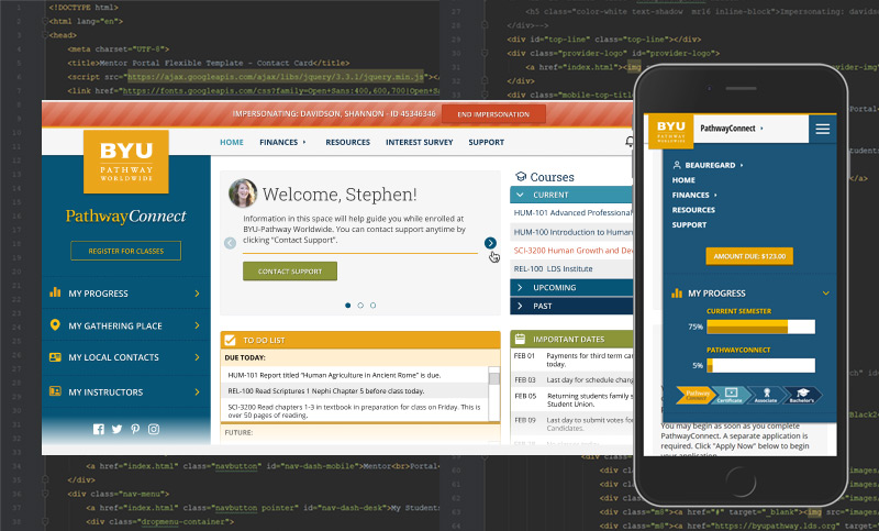
The Process
This is one of the biggest projects I've ever had to tackle... so I started from the beginning and did a ton of research on what a good student portal consisted of. I contacted several online universities and interviewed designers and decision makers so I could understand the processes they went through to get to their final product. After my initial research, I had to put on the Business Analyst hat and work with BYU Pathway Worldwide to come up with the business requirements and user journeys. That whole process took about three months.
Once I had the user journeys complete (done mostly as sketches on paper and white boards) I started to iterate on designs and did a ton of user testing before coming up with the final hi-fi designs. Iterations included color and font tests for color-blind users. I had to prove to the business their branding and styles didn't translate to a functional web application without some tweaks to the color and font schemes. It was a battle, but the right decisions were eventually made by the business. User testing and online ADA tools helped make the argument.
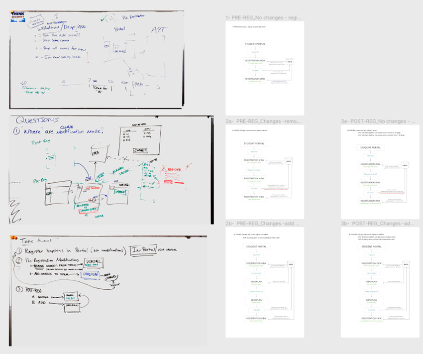

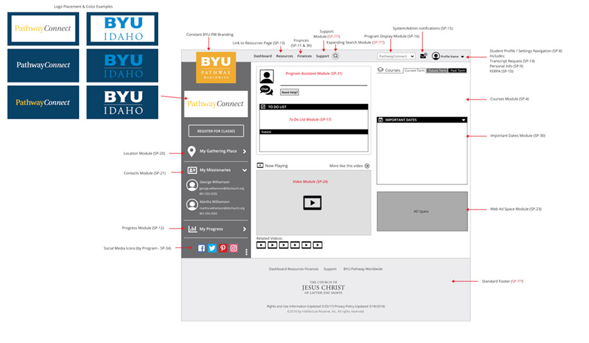
UX Design in Sketch
During this project we migrated from Sketch to Figma so the initial designs were done in Sketch and finished in Figma.

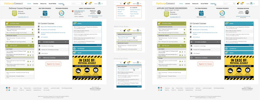
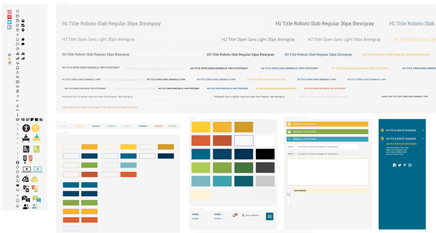
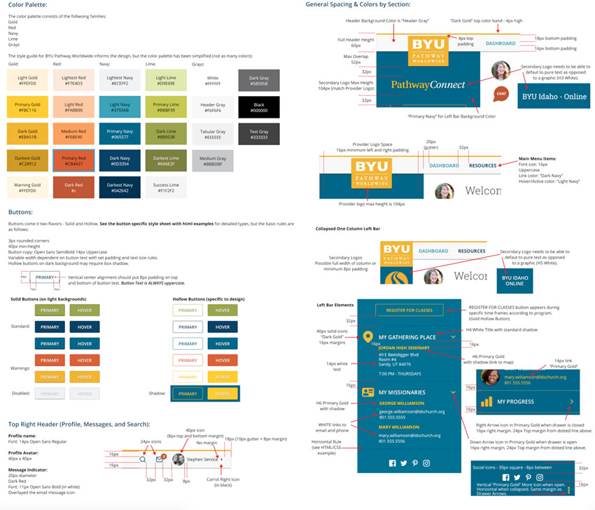
Part of what I had to do with this design is come up with a working style guide that was similar, but separate from the branding guide I was given.
Final Designs and Prototypes
The initial student portal has been turned into three different projects based on the same designs templates. The three projects include: A) The original student portal for PathwayConnect and EnglishConnect students. B) The "Online Degree" portal for students who attend BYU Idaho-Online. C) A Mentor Portal used by student mentors to help and track student progression through their education cycle.

I have provided links to the ACTUAL coded prototypes I created and handed off to the developers. Normally, this department has "full stack" developers that do 100% of the coding. However, they weren't very strong on the front end (specifically HTML and CSS) so I was also tasked with coding the responsive UI. The three prototype links below are the actual code templates I handed to the developers. Each link will open a new window.
Prototype: PathwayConnect and EnglishConnect Student Portal
Prototype: Online Degree Student Portal
Prototype: Mentor Portal (Note: links for "Jeremiah Black" open more detail pages)
UP NEXT - EnglishConnect3 - English Language Learning Application
BYU Pathway is quickly growing into a very large, global education system. With that growth, they needed a student portal to keep students informed.
UX Research, UX Design, UI Development (HTML and CSS code)
Project is currently in production and being used by students all over the world.